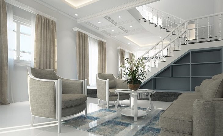
Many homeowners make mistakes that cost them dearly on the property market when it comes to property styling. It’s often hard to visualise your property styled differently from how you are accustomed to it. As a result, taking a new approach to styling becomes difficult and numerous blunders are often made. Here are some of the common mistakes to avoid.
Expressing Your Taste
In every home, several items add personality to the space. These include personal artefacts, paintings, relics from travels and other collections.
Although the personal items add character to a space, they’re counterproductive if you want to sell your house. A property that is up for sale needs a neutral, blank feel that welcomes varied styling options. It should be a blank canvass.
Therefore, to avoid distraction, put away all personal effects while staging. In addition, take down personal framed photos and other sentimental collections.
Paint neutral colours over feature walls to unify the overall design. Furniture pieces should also have neutral colours to allow potential buyers to visualize their styling. Furthermore, colourful carpets shouldn’t be in staged spaces.
Remember, staging isn’t meant to meet your liking. You’re doing it for the buyer.
Poor Furniture Choices
It’s crucial to match your furniture pieces with the overall style of the space. A contemporary furniture piece in a traditional style home will look out of place.
Moreover, stick to simple furniture designs that have versatile applications. The choice of material, the colour design, and the furniture piece’s size should all be considered thoroughly.
Inconsistency
Although your property may have several rooms, styling requires a unified approach. Therefore, you should look at all the rooms as a single entity and settle on a uniform design.
Each room should tie in with the adjacent spaces to avoid a disjointed look. Consistency and balance are the main objectives when styling the rooms. Furniture pieces, fittings, wall colour, and flooring should follow a unified theme.
Mixing styles may be detrimental to your marketing efforts. Despite the possibility of different themes blending well, you should always stick to a straightforward style. Moreover, don’t attempt to pull off complicated styles; stick to basics.
Overly Staging
Staging is not as simple as it looks. Every homeowner wants to present their property in the best light, and unfortunately, most people overdo it.
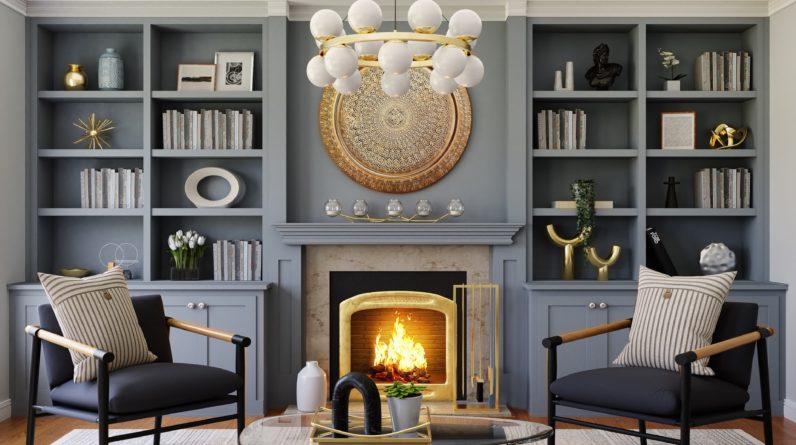
Many staged homes have excess accessories. Unfortunately, instead of enhancing the property’s overall appeal, the accessories make the spaces look too busy. Vases, statues, artworks and wall clocks are some of the fittings you should only put up after careful consideration.
Fitting many accessories doesn’t always translate to a good look.
Under-staging
On the other hand, some homeowners are guilty of not fitting enough accessories in their indoor spaces.
Accessories are designed to enhance the aesthetics of a space and fill gaps that would otherwise stand out as eyesores.
The lack of accessories may create a mundane look that doesn’t pass for an empty canvass but a repulsive void.
For the perfect balance, use subtle fittings with a small visual print. Moreover, if the accessory is functional as a wall clock, it’s easy to reconcile the general look.
Property styling is a complex process despite the simplicity of the outcome. For the best results, you should consult professional property stylists. If you are going to style your property, do it right.
Read More:
Tips To Style The Perfect Guest Room
Five Best Professional Property Styling Companies in Sydney

