A logo is a symbol or other design adopted by an organization to identify its products, services, uniform, vehicles, and other entities owned or operated by the business. It’s often the first impression that potential clients have of your business, so it’s important to make it count! Logos are meant to quickly identify your business rather than offer an in-depth explanation of what your business provides. A logo should be easily recognizable and memorable so that people can easily connect the logo to your business. Here are our top six fundamental tips to create the perfect logo for your organization.

1. Think Critically
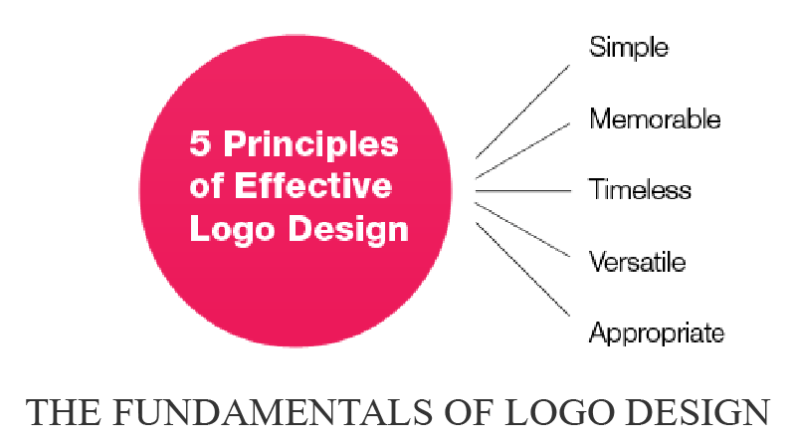
Before you even begin sketching ideas for a logo, review the basic principles that a logo should follow:
- Simple – a clear, straightforward design allows the logo to be easily recognized and remembered. An effective logo should be unique without being too complicated.
- Memorable—Logos should be easy to remember. A logo isn’t much use to a company if nobody can remember that it’s connected to that company!
- Lasting—It’s impossible to predict the future, but you’ll want to make sure that your logo is not so specific that it will look very outdated in 10 years. Choose something simple that will stand the test of time.
- Adaptable—A logo will be most useful to you if you can use it across a wide variety of mediums—think online, in a brochure design, on business cards, on vehicles, or on uniforms.
- Appropriate—Make sure the design is appropriate for your line of work. For example, you probably wouldn’t want to use a colourful children’s-style font in the logo for a bank.
2. Draw and Redraw
At the beginning of a logo-creation, paper and pen drawings can be just as effective as drawings made with special design software. Try creating 20 or more sketches encompassing different logo ideas, then take a break and go back to these ideas again to build on your favorite concepts. Keep repeating this process until you end up with a few that really strike you and fit the criteria for an effective logo.
3. Consider Colour
Volumes have been written about the theories on what certain colours make us feel or behave but understanding the basics can help you to create an effective and attractive logo.
- Don’t use colours that are so light that they are difficult to read on a light background (and vice versa for dark colors), or colours that are very hard on the eyes, such as neon green.
- Colours close to each other on the colour wheel tend to work well together in logos (i.e. blue, green and purple hues for a “cool” palette).
- Even if your logo is in colour, make sure that it is also legible and attractive in black and white or grayscale.
4. Size
A good logo should be clear and attractive whether it’s enlarged or shrunk to fit a specific purpose. Your logo should not deteriorate in quality when shrunk down to fit on envelopes, letterhead, and promotional materials. It should also be crisp and clear if it’s enlarged for billboards, television, or large banners. Scaling a logo down tends to be where problems arise, so try printing a test logo out in a letterhead format to check if it is still legible.
5. Balance
Our eye tends to be drawn more to balanced designs rather than imbalanced ones. Balance can refer to both the thickness of the font as well as the placement of graphics or symbols in the design. For example, if your company logo is the name of the company followed by a tree graphic, you may want the first letter of the company name to be enlarged to create balance with the tree graphic on the other end.
6. Font
Choosing a great-looking font is perhaps one of the toughest challenges in creating a great-looking logo. If your logo contains text, you’ll want to test your design with many different fonts before making your choice. Fonts can totally change the mood of your logo, so you’ll want to make sure you try out many different styles including serif and sans-serif, script, italic, and bold fonts.
In most logo-design cases, you’ll want to avoid commonly used fonts like Arial or Times New Roman, as they can come off as amateur-looking because everyone has access to them. You’ll also want to check that your font can still be read even when scaled down. This is especially important for script-style fonts, which can become quite cramped as they shrink down.
In your logo design, one uniform font is ideal. Two fonts can work in some cases, but more than two fonts in one design is not recommended as if can end up looking cluttered.


